Explorando herramientas de código abierto para el análisis de datos
Ramón Reyes C
8 y 9 de noviembre de 2017
Inicio
Plan
Introducción
Estadística - R
Orange
Álgebra lineal
SVD
Big data
Las técnicas de análisis de big data se basan por un lado en las bases teóricas de la estadística y mineria de datos, las cuales se han adecuado a las necesidades actuales (las V´s), con aportaciones de las ciencias de la computación; para asi dar lugar a lo que se conoce ahora como ciencia de datos.
¿Que entendemos por estadística?
- Datos
- Interpretaciones
Asignatura
Análisis de datos
- Método (conocimiento del dominio de aplicación):
- Plantear, identificar un problema o pregunta
- Recolectar los datos necesarios
- Observación, experimentación, muestreo, …
- Organización y representación de los datos
- Analisis
- Gráficas. histogramas, frecuencias
- max, min, media, mediana, desviación, varianza,
- minimos cuadrados, regresiones
- Interpretción - conclusión - predicción
- ¿muestra? ¿errores de medición? ¿ruido?
- modelos (probabilidad, inferencia estadística)
Software
Usaremos R-(studio). Es un lenguaje de programación orientado al análisis estadístico, basado en S-plus.
Orange Sistema interactivo de código abierto para la visualización y análisis de datos, incluye herramientas de aprendizaje de maquina.
ImageMagick Programa para la manipulación de imágenes
Estadística
Datos y sus relaciones
Son observaciones o casos que comunmente organizamos como renglones en una tabla, con columnas las variables de dichas observaciones.
Para un conjunto de datos “cars”
head(cars)## speed dist
## 1 4 2
## 2 4 10
## 3 7 4
## 4 7 22
## 5 8 16
## 6 9 10Tipos de variables
- Numéricas
- Discretas vs. Continuas
- Categóricas
- Ordinales (niveles) vs. Nominales
library(readxl)
students <- read_excel("students.xls")
show(students)
## # A tibble: 30 x 14
## ID `Last Name` `First Name` `Average score (grade)` SAT Gender
## <dbl> <chr> <chr> <dbl> <dbl> <chr>
## 1 1 DOE01 JANE01 67.00000 2263 Female
## 2 2 DOE02 JANE02 63.00000 2006 Female
## 3 3 DOE01 JOE01 78.11328 2221 Male
## 4 4 DOE02 JOE02 77.80859 1716 Male
## 5 5 DOE03 JOE03 65.00000 1701 Male
## 6 6 DOE04 JOE04 69.00000 1786 Male
## 7 7 DOE05 JOE05 95.88251 1577 Male
## 8 8 DOE03 JANE03 87.00000 1842 Female
## 9 9 DOE04 JANE04 91.00000 1813 Female
## 10 10 DOE05 JANE05 71.00000 2041 Female
## # ... with 20 more rows, and 8 more variables: `Student Status` <chr>,
## # Major <chr>, Country <chr>, Age <dbl>, X__1 <lgl>, X__2 <lgl>, `Height
## # (in)` <dbl>, `Newspaper readership (times/wk)` <dbl>Relaciones
Dado un par de variables (numéricas) estas son entre si:
- Dependientes
plot(cars$speed, cars$dist, main="Ejemplo 1", xlab="Speed", ylab="Dist")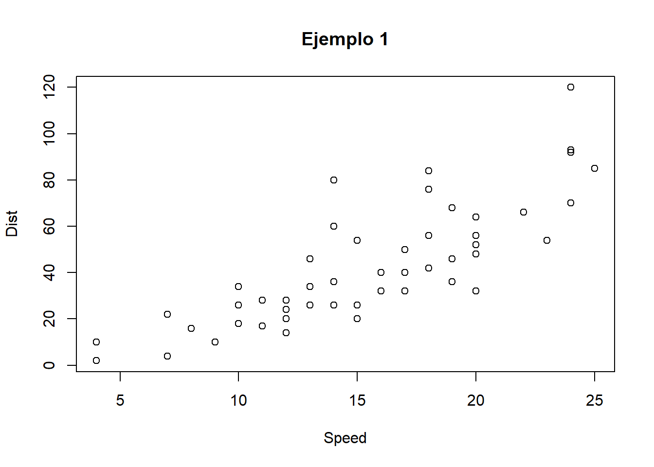
Relaciones
- Independientes
plot(students$`Average score (grade)`, students$Age, main = "Ejemplo 2",
     xlab="Calificación", ylab="Edad")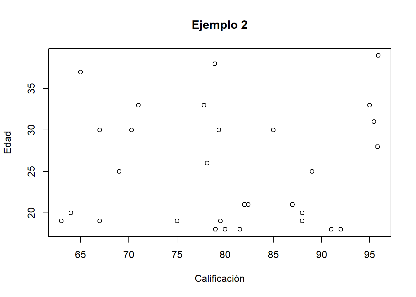
Examinando variables numéricas
Resumen
str(mtcars)## 'data.frame': 32 obs. of 11 variables:
## $ mpg : num 21 21 22.8 21.4 18.7 18.1 14.3 24.4 22.8 19.2 ...
## $ cyl : num 6 6 4 6 8 6 8 4 4 6 ...
## $ disp: num 160 160 108 258 360 ...
## $ hp : num 110 110 93 110 175 105 245 62 95 123 ...
## $ drat: num 3.9 3.9 3.85 3.08 3.15 2.76 3.21 3.69 3.92 3.92 ...
## $ wt : num 2.62 2.88 2.32 3.21 3.44 ...
## $ qsec: num 16.5 17 18.6 19.4 17 ...
## $ vs : num 0 0 1 1 0 1 0 1 1 1 ...
## $ am : num 1 1 1 0 0 0 0 0 0 0 ...
## $ gear: num 4 4 4 3 3 3 3 4 4 4 ...
## $ carb: num 4 4 1 1 2 1 4 2 2 4 ...summary(mtcars)## mpg cyl disp hp
## Min. :10.40 Min. :4.000 Min. : 71.1 Min. : 52.0
## 1st Qu.:15.43 1st Qu.:4.000 1st Qu.:120.8 1st Qu.: 96.5
## Median :19.20 Median :6.000 Median :196.3 Median :123.0
## Mean :20.09 Mean :6.188 Mean :230.7 Mean :146.7
## 3rd Qu.:22.80 3rd Qu.:8.000 3rd Qu.:326.0 3rd Qu.:180.0
## Max. :33.90 Max. :8.000 Max. :472.0 Max. :335.0
## drat wt qsec vs
## Min. :2.760 Min. :1.513 Min. :14.50 Min. :0.0000
## 1st Qu.:3.080 1st Qu.:2.581 1st Qu.:16.89 1st Qu.:0.0000
## Median :3.695 Median :3.325 Median :17.71 Median :0.0000
## Mean :3.597 Mean :3.217 Mean :17.85 Mean :0.4375
## 3rd Qu.:3.920 3rd Qu.:3.610 3rd Qu.:18.90 3rd Qu.:1.0000
## Max. :4.930 Max. :5.424 Max. :22.90 Max. :1.0000
## am gear carb
## Min. :0.0000 Min. :3.000 Min. :1.000
## 1st Qu.:0.0000 1st Qu.:3.000 1st Qu.:2.000
## Median :0.0000 Median :4.000 Median :2.000
## Mean :0.4062 Mean :3.688 Mean :2.812
## 3rd Qu.:1.0000 3rd Qu.:4.000 3rd Qu.:4.000
## Max. :1.0000 Max. :5.000 Max. :8.000#setwd(choose.dir()) # Select the working directory interactively
#loadhistory(file="mylog.Rhistory")
#history()
#mydata <- read.csv(file.choose(), header = TRUE)una variable
En una linea
stripchart(airquality$Ozone,main="DOT plots",
 xlab="Partes por miles de millón",
 ylab="Ozono",)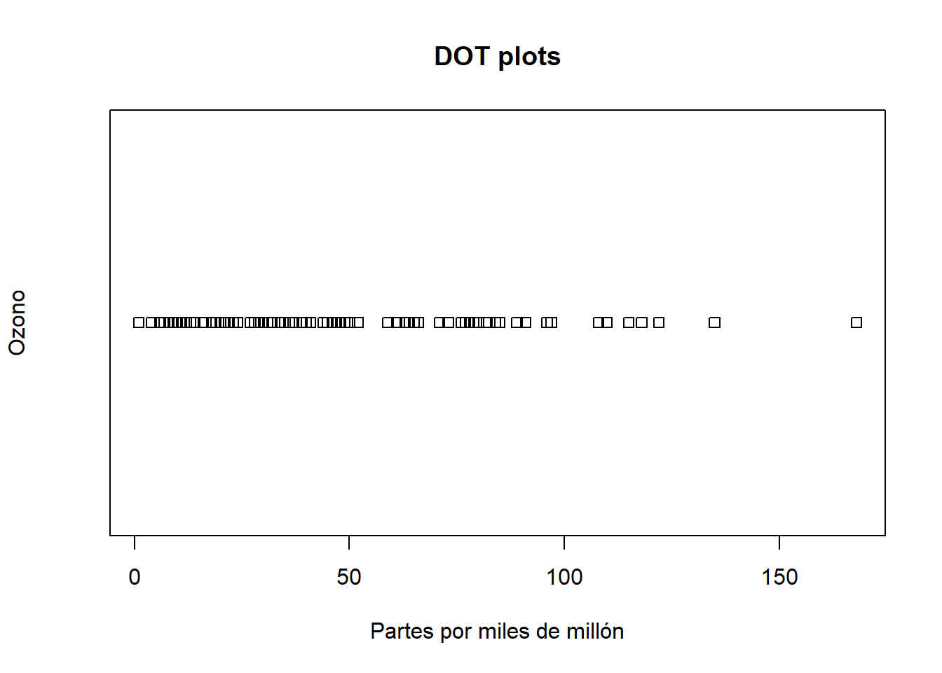
sin encimar
Separados
stripchart(airquality$Ozone,main="DOT plots",
 xlab="Partes por miles de millón",
 ylab="Ozono", method="stack")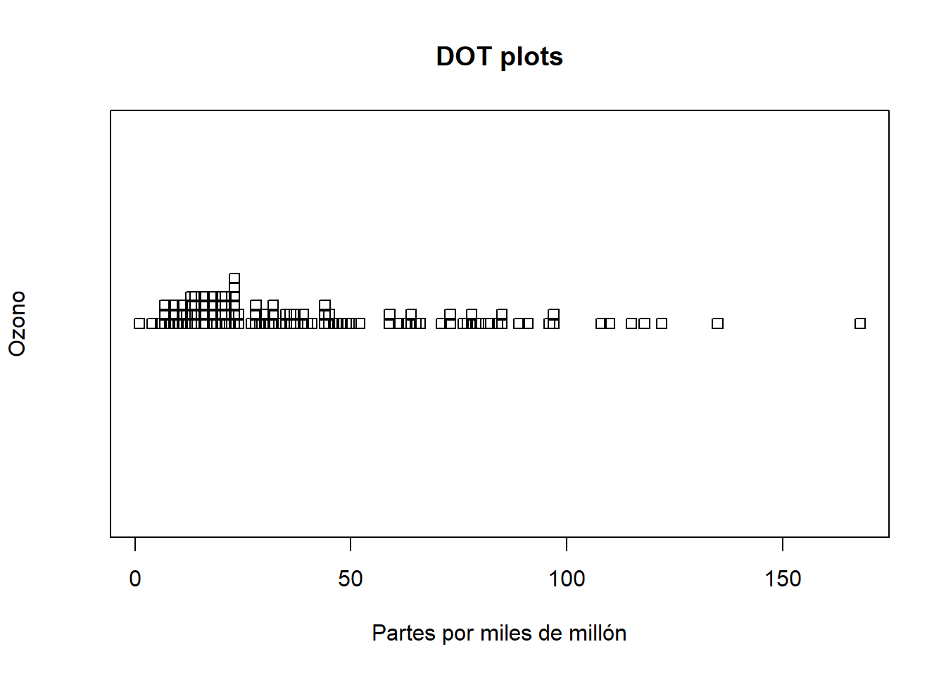
comparando
distribución normal con la misma media y desviacion estandar
air <- airquality$Ozone
airNorm <- rnorm(200,mean=mean(air, na.rm=TRUE), sd = sd(air, na.rm=TRUE))
x <- list("air"=air, "normal"=airNorm)
stripchart(x,
 main="comparación",
 method="jitter",
 col=c("orange","red"),
 pch=16)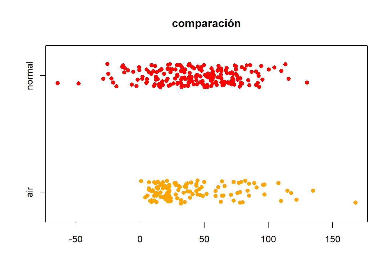
agrupando y colorenado
usando una variable categórica
x <- mtcars[order(mtcars$mpg),] # sort by mpg
x$cyl <- factor(x$cyl) # it must be a factor
x$color[x$cyl==4] <- "red"
x$color[x$cyl==6] <- "blue"
x$color[x$cyl==8] <- "darkgreen"
dotchart(x$mpg,labels=row.names(x),cex=.7,groups= x$cyl,
    main="Gas Milage for Car Models\ngrouped by cylinder",
   xlab="Miles Per Gallon", gcolor="black", color=x$color)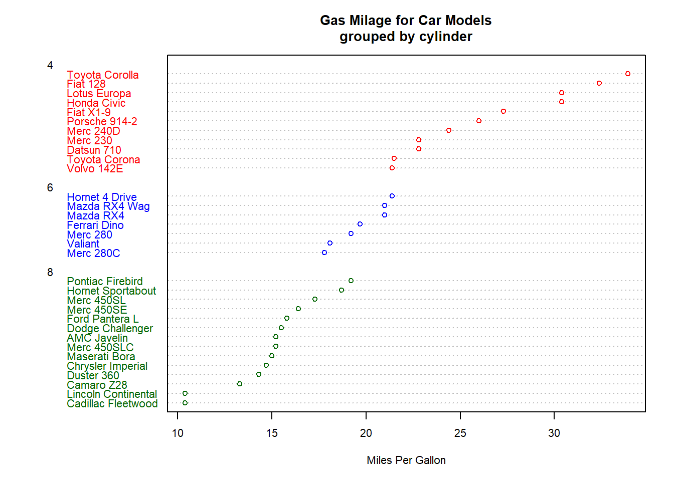
histogramas
graficamos la frecuencia con que aparece cada dato
inputPanel(
  selectInput("n_breaks", label = "Number of bins:",
              choices = c(10, 20, 35, 50), selected = 20),

  sliderInput("bw_adjust", label = "Bandwidth adjustment:",
              min = 0.2, max = 2, value = 1, step = 0.2)
)renderPlot({
hist(faithful$eruptions, probability = TRUE, breaks = as.numeric(input$n_breaks),
xlab = "Duration (minutes)", main = "Geyser eruption duration")
dens <- density(faithful$eruptions, adjust = input$bw_adjust)
lines(dens, col = "blue")
})Curva normal
x <- mtcars$mpg
h<-hist(x, breaks=10, col="red", xlab="Miles Per Gallon",
   main="Histograma con curva normal")
xfit<-seq(min(x),max(x),length=40)
yfit<-dnorm(xfit,mean=mean(x),sd=sd(x))
yfit <- yfit*diff(h$mids[1:2])*length(x)
lines(xfit, yfit, col="blue", lwd=2) 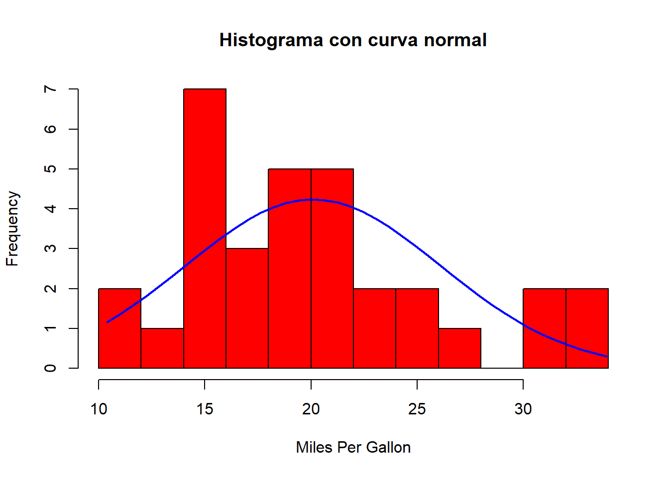
Densidad
library(ggplot2)
set.seed(1234)
df <- data.frame(
  sex=factor(rep(c("F", "M"), each=200)),
  weight=round(c(rnorm(200, mean=55, sd=5), rnorm(200, mean=65, sd=5)))
  )
p <- ggplot(df, aes(x=weight)) +
 geom_histogram(aes(y=..density..), colour="black", fill="white", bins=30)+
 geom_density(alpha=.2, fill="#FF6666")
p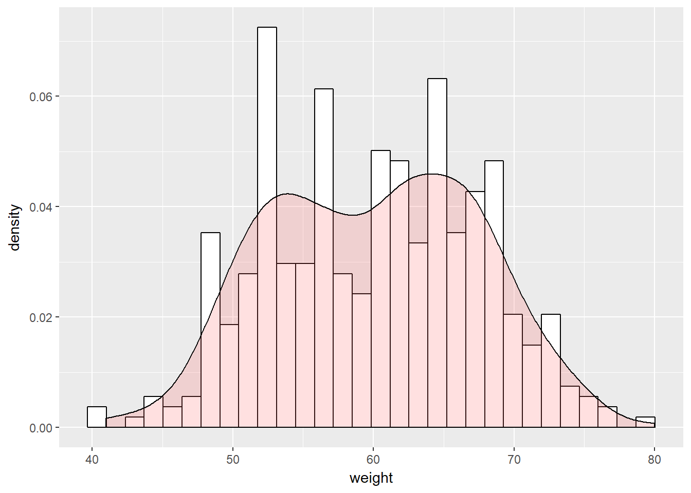
Agrupando
library(ggplot2)
library(plyr)
mu <- ddply(df, "sex", summarise, grp.mean=mean(weight))
p<-ggplot(df, aes(x=weight, color=sex)) +
  geom_histogram(fill="white", position="dodge", bins=25)+
  geom_vline(data=mu, aes(xintercept=grp.mean, color=sex),
             linetype="dashed")+
  theme(legend.position="top")
p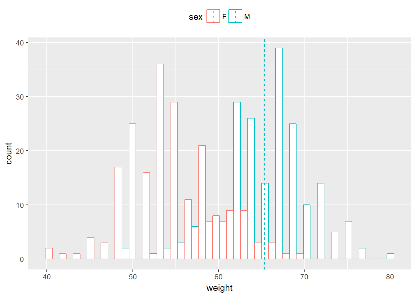
box plots (quartiles, mediana) (media: centro de la distribución)
library(ggplot2)
# Convert the variable dose from a numeric to a factor variable
ToothGrowth$dose <- as.factor(ToothGrowth$dose)
# Add basic box plot
ggplot(ToothGrowth, aes(x=dose, y=len)) +
  geom_boxplot()+
  geom_jitter(position=position_jitter(0.2))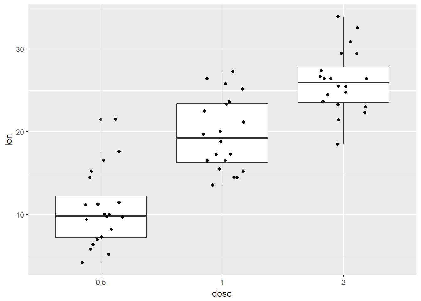
Box 2
library(ggplot2)
ToothGrowth$dose <- as.factor(ToothGrowth$dose)
# Add notched box plot
ggplot(ToothGrowth, aes(x=dose, y=len)) +
  geom_boxplot(notch = TRUE)+
  geom_jitter(position=position_jitter(0.2))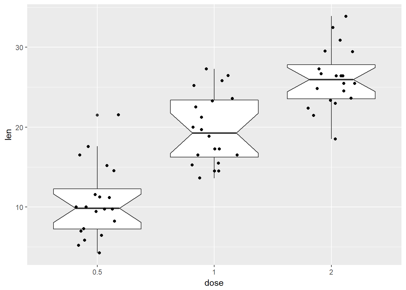
# Add violin plotBox 3
library(ggplot2)
ToothGrowth$dose <- as.factor(ToothGrowth$dose)
ggplot(ToothGrowth, aes(x=dose, y=len)) +
  geom_violin(trim = FALSE)+
  geom_jitter(position=position_jitter(0.2))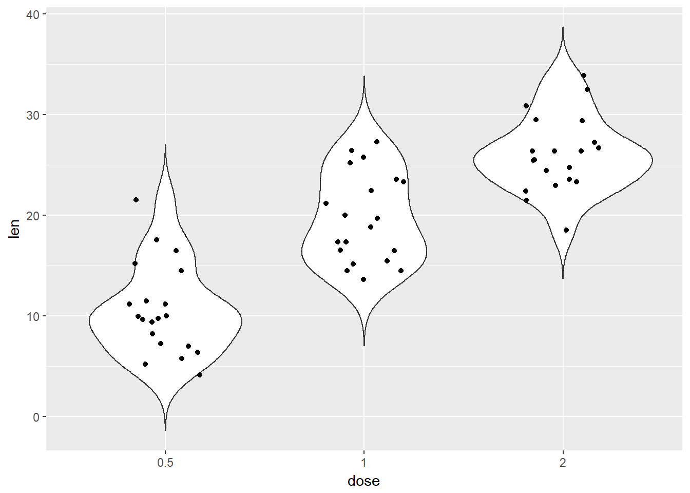
dos variables
- scatterplots gráfica de un par de variables
plot(mtcars$wt, mtcars$mpg)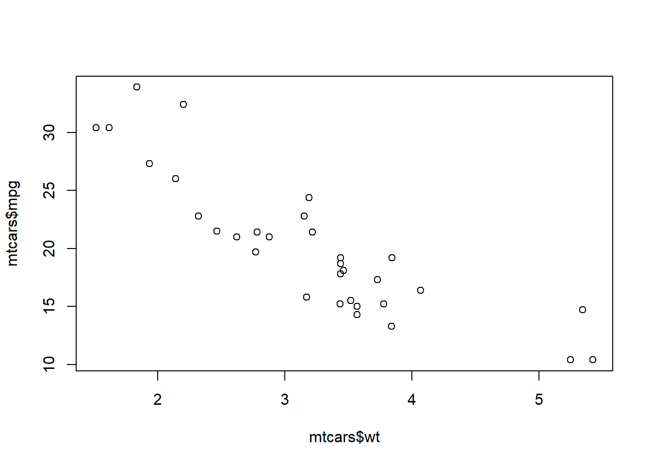
Regresión
set.seed(955)
# Make some noisily increasing data
dat <- data.frame(cond = rep(c("A", "B"), each=10),
                  xvar = 1:20 + rnorm(20,sd=3),
                  yvar = 1:20 + rnorm(20,sd=3))


library(ggplot2)
ggplot(dat, aes(x=xvar, y=yvar)) +
    geom_point(shape=1) +    # Use hollow circles
geom_smooth(method=lm) # Add linear regression line 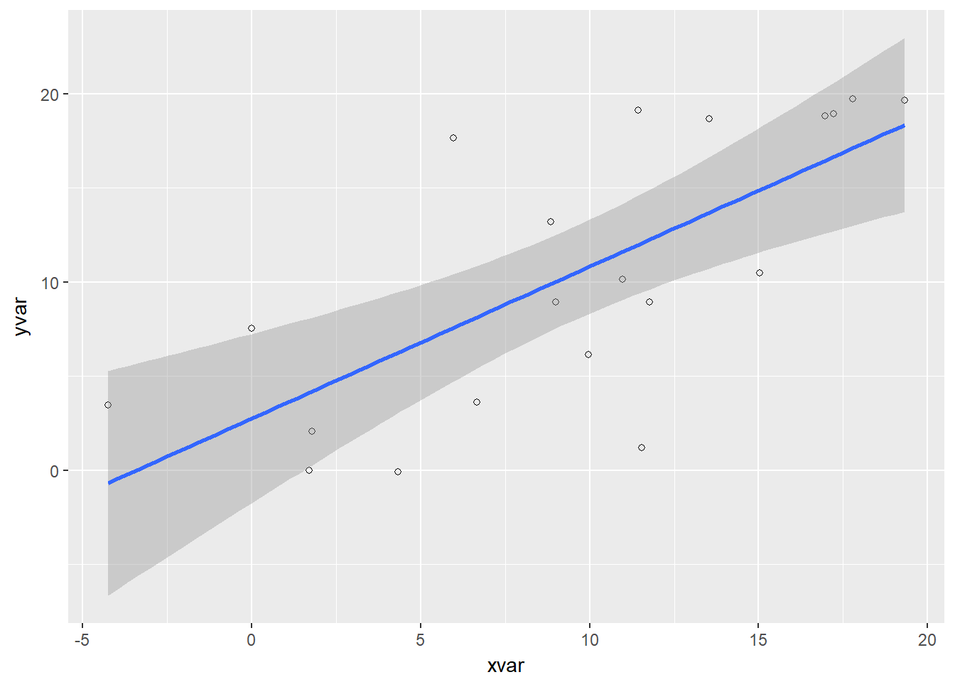
# (by default includes 95% confidence region)Correlación
- Matriz de correlaciones
my_data <- mtcars[, c(1,3,4,5,6,7)]
res <- cor(my_data)
round(res, 2)
## mpg disp hp drat wt qsec
## mpg 1.00 -0.85 -0.78 0.68 -0.87 0.42
## disp -0.85 1.00 0.79 -0.71 0.89 -0.43
## hp -0.78 0.79 1.00 -0.45 0.66 -0.71
## drat 0.68 -0.71 -0.45 1.00 -0.71 0.09
## wt -0.87 0.89 0.66 -0.71 1.00 -0.17
## qsec 0.42 -0.43 -0.71 0.09 -0.17 1.00Resumen
library("zoo", quietly =TRUE)
library("PerformanceAnalytics", quietly =TRUE)
chart.Correlation(my_data, histogram=TRUE, pch=19)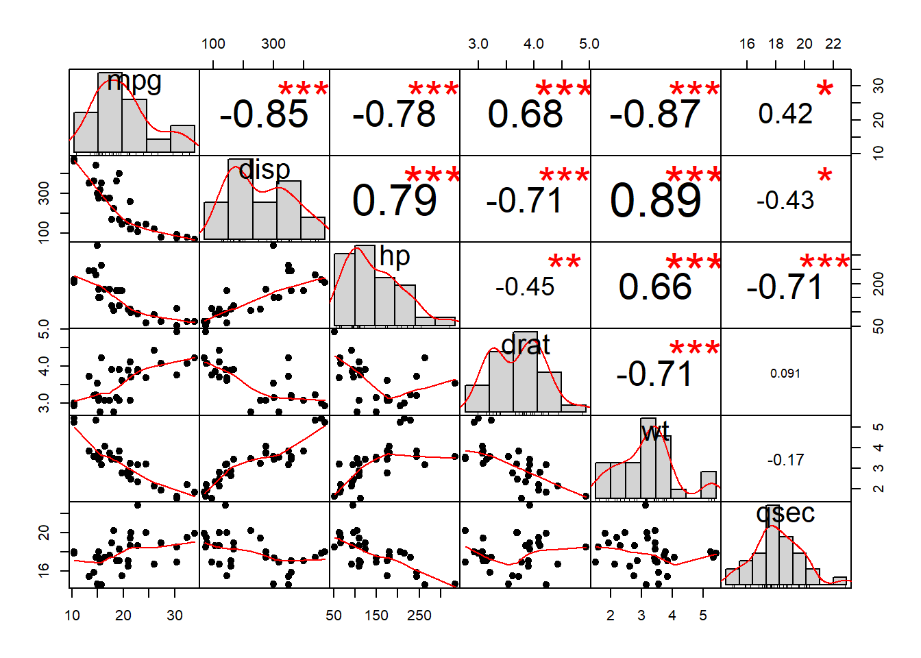
Examinando variables categoricas
bar, tablas, pies?
counts <- table(mtcars$vs, mtcars$gear)
barplot(counts, main="Distribution cars Gears - VS",
  xlab="Number of Gears", col=c("darkblue","red"),
legend = rownames(counts)) 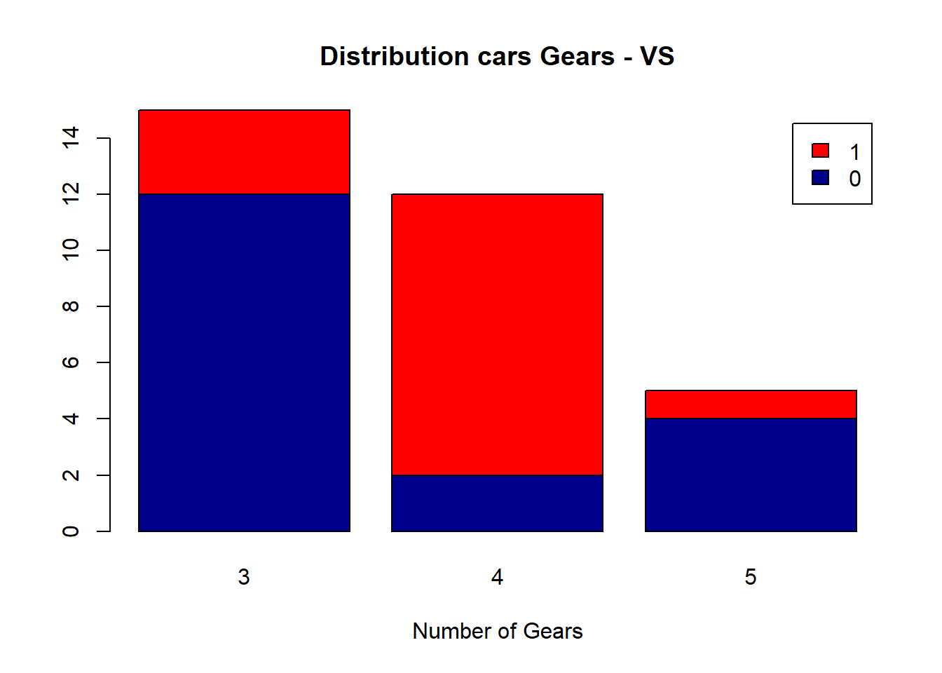
mosaic plots* (segmentación)
data(Titanic)
mosaicplot(Titanic,
main = "Supervivencia en el Titanic",
col = hcl(c(240, 120)),
off = c(5, 5, 5, 5))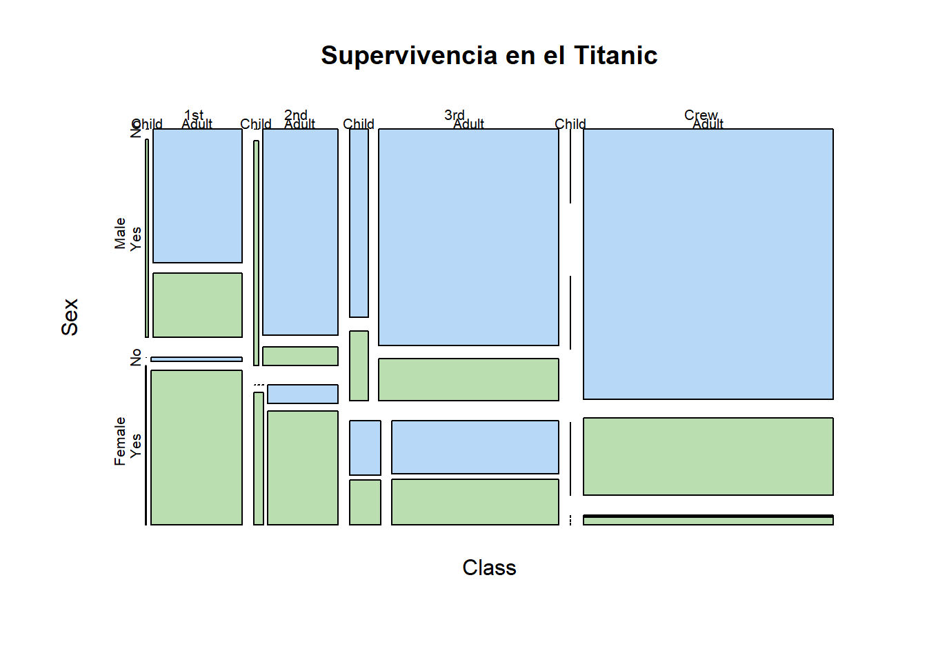
Descomposición en valores singulares
Motivación
plot(NULL,xlim=c(-3,3),ylim=c(-3,3),ylab="y",xlab="x")

xs  <- seq(0,2*pi,0.05)
pts <- matrix(c(cos(xs),sin(xs)),length(xs),2) # points from a unit circle
points(pts, col="red", type="l")               # draw them

scaling <- matrix(c(.5, 0,
                     0, 2),2,2)
theta <- -pi/4
rotating <- matrix(c( cos(theta),sin(theta),
                     -sin(theta),cos(theta)),2,2)

pts2 <- t(apply(pts,1,function(p)rotating %*% scaling %*% p))
points(pts2, col="green", type="l")             # draw transformation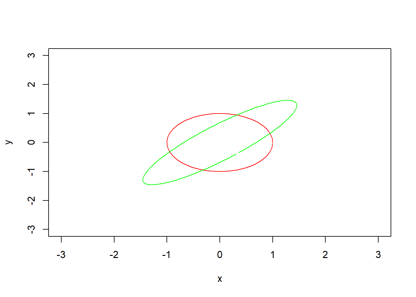
Definiciones
- Transformación lineal
- Matriz
- Valor propio
- Vector propio
Matriz genérica
Siempre transforma la esfera en un elipsoide
- Valor singular semiejes \(\{\sigma_1,\ldots,\sigma_n\}\)
- Vector singular izquierdo direcciones \(\{u_1,\ldots,u_n\}\) vectores propios de \(A\times A^\perp\)
- Vector singular derecho imagenes inversas \(Av_i=\sigma_iu_i\) vectores propios de \(A^\perp\times A\)
Teorema
Sea \(A\) una matriz de tamaño \(m\times n\) con entradas en \(\mathbb{R}\). Existen matrices \(U\), \(V\) y \(\Sigma\) con las siguientes propiedades:
- \(U\) es una matriz ortogonal de tamaño \(m\times m\) con entradas reales;
- \(V\) es una matriz ortogonal de tamaño \(n\times n\) con entradas reales;
- \(\Sigma\) es una matriz diagonal de tamaño \(m\times n\) cuyas entradas son números reales no negativos (que \(\Sigma\) sea diagonal significa que \(\Sigma_{ij}=0\) siempre que \(i\neq j\));
- \(\Sigma_{ii}\geq\Sigma_{jj}\) siempre que \(i<j\);
- \(A=U\Sigma V^t\).
Aplicaciones
Inversa generalizada
- No \(A\times B=I\) sino \(A\times B\times A=A\)
- Compresión de imágenes
- Componentes principales
Regresión lineal